Election & Outlook Interactive Features
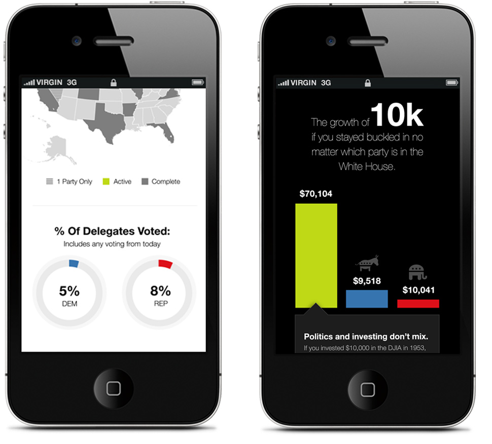
Investor fears tend to swell during periods of political instability. To help educate investors during the 2016 election cycle, we created an interactive timeline that paired with a growth chart tracking returns during presidential terms. Our firm's 2019 Market Outlook touched upon many of the same election and investment themes. My role in these projects was Creative Director, UX/UI designer, and interaction designer.

Sketches, Concepts, and UX Challenges
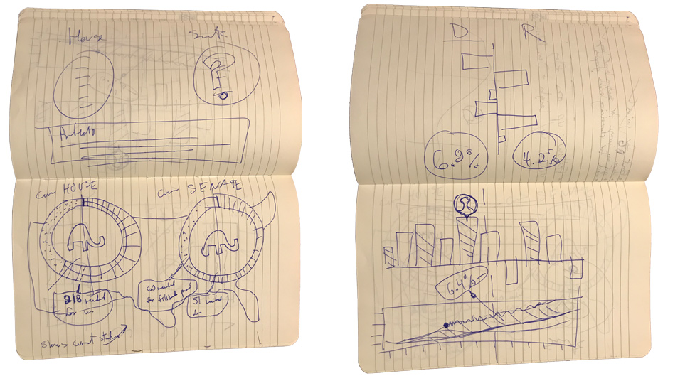
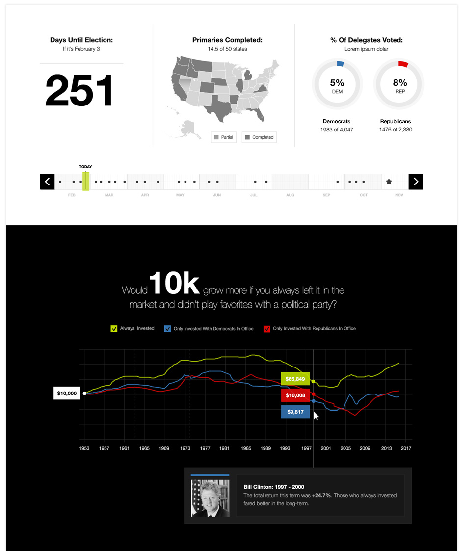
The two core goals of the 2016 election feature were to allow users to see a quick snapshot of the election cycle, and to spotlight the idea that investing should be a politically agnostic endeavor. These sketches show early concepts of the "Election Timeline" and the "Growth of 10k" chart.

UI and Creative Decisions
The use of red and blue to denote political parties was used throughout this experience. Adding president headshots to the growth of 10k chart allowed for quick discovery of financial returns during different presidential terms. Alternating black and white backgrounds helped to differentiate the separate yet related interactives, and the use of large, bold fonts helped to call attention to key stats and titles.

Interaction and Animation
I created an animated concept of our 2019 Outlook feature that showcases interactive maps, detailed regional sections, and seamless transitions from section to section. This feature allowed our editors and marketing teams to use data and storytelling to showcase our firm's perspectives on current events. This concept shows how we're able to feature large amounts of content in an intuitive experience that uses a persistent navigation bar.