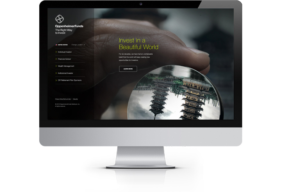
OppenheimerFunds Homepage For New Users
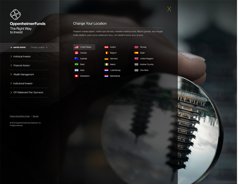
The approach to new or unrecognized users visiting OppenheimerFunds presented the opportunity to personalize user-journeys and the content that's being seen. This experience allows users to self-select their location and role, and it allows the brand to promote relevant and engaging content. My role in this project was Creative Director, UX/UI designer, and interaction designer.

UI and Creative Decisions
For this project, I bypassed wireframes and sketches and moved directly into visual design where I worked on UX and UI simultaneously. For projects with simpler user-flows and features, this can sometimes be the most effective and efficient use of time and resources. I used brand-campaign imagery as the backdrop for my designs to ensure a close connection to other public-facing messages that our users might be seeing. I used the full width and height of the browser window to create a wide-open canvas that focuses on impactful photography and gives a premium first impression.


Interaction and Animation
Reusing the same space over-and-over in a thoughtful way allowed us to keep this experience feeling light, minimal, and uncluttered. Content, location choices, and user roles slide in-and-out of focus at contextually relevant moments so that users are only given options when they're needed.